Turn a public dataset into a live explorer in one evening
Raw CSV or JSON from any open data source becomes a filterable, shareable explorer on your own domain. No backend, no API keys, no runtime cost. Proof lives on-site. I've run this four times.
- Time
- 3 – 5 hours
- Cost
- $0
- Stack
- Next.jsCSV/JSON parsingA chart libraryClaude Code
You’re stuck with
You found interesting public data but can't turn it into anything shareable. Stashing the CSV in a repo nobody opens is not proof. Screenshotting a Python notebook is not marketing.
You end up with
A `/your-explorer` route on your own domain with filters, one headline chart, and a shareable URL. Static build, zero runtime cost, indexable by search engines, embeddable anywhere.
This workflow produced
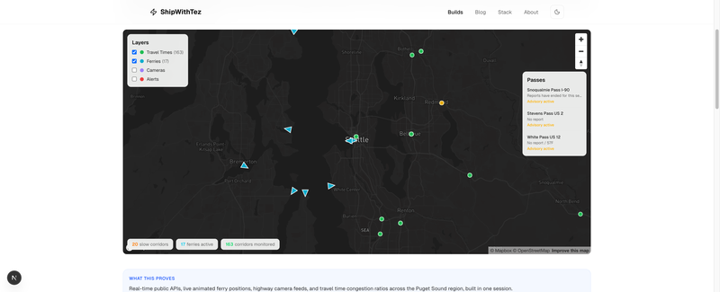
Seattle Metro Explorer
A living portrait of the Seattle metro. Travel time corridors color-coded by congestion, ferries moving across the Sound in real time, live highway cameras on click, mountain pass conditions, and highway alerts.
The recipe
1. Pick the smallest interesting slice
Every dataset has too much. Your job on day one is narrowing.
Pick one question the data can answer cleanly. Not three. One. Examples from my own runs:
- Seattle Traffic Explorer: "Where and when does traffic actually peak on Seattle-area freeways?"
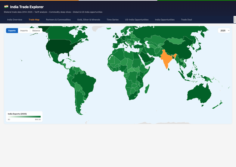
- India Trade Explorer: "Which commodities drive India's trade surplus with the US and which with China?"
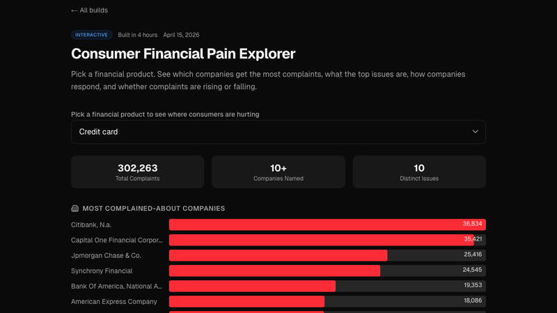
- Consumer Financial Pain: "What percentage of CFPB complaints about credit cards actually get resolved in the consumer's favor, and by which bank?"
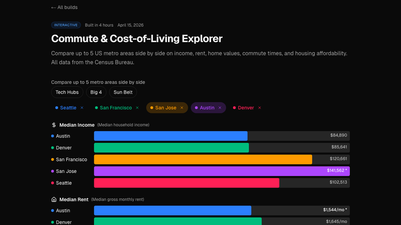
- Cost-of-Living Explorer: "Is Seattle actually more expensive than Austin once you correct for housing subtype?"
If your "question" takes more than one sentence, it's still too broad. Split it until each version fits on one line. Ship each one separately.
2. Normalize the raw data into shippable JSON
Public data comes in hostile formats, wide Excel sheets, pipe-delimited text, XML with nested envelopes, zip-bombed CSVs. Your goal: one data.json file under public/data/<dataset>/ that your UI can fetch without any server logic.
A short Node or Python script does this once. Check the output file into git. Never parse the raw source at runtime.
Keep the JSON flat. Each row is an object with primitive fields. No nested arrays unless you actually need them. The smaller and flatter the file, the faster the explorer loads on mobile.
If the file is over ~500KB gzipped, pre-aggregate: group by the dimensions your filters expose, drop the raw rows, ship the aggregate. Users almost never need row-level data for an exploratory UI.
3. Pick 2 to 3 dimensions that drive the story
Filters are the explorer. Too many filters and the UI gets busy. One filter and it's a chart, not an explorer.
For the Seattle Traffic build, the driving dimensions were freeway segment, direction of travel, and hour of day. Those three filters turn a static chart into "show me what my commute actually looks like." For Cost of Living, it was city, housing subtype, and household size. Each filter must change the output in a way that produces an aha.
If a filter doesn't change the punchline, delete it.
4. Add the one headline chart
One chart at the top answers the main question at a glance. Not "here are ten charts, pick one." One chart. The filters modify it. That's the whole UI contract.
Pick the chart type that matches the question, then make it look like it belongs on your site, not on the data source's portal. Colors from your brand, fonts from your layout, responsive breakpoints that actually work on mobile.
5. Add one comparison that reveals something non-obvious
This is the bit that gets shared. After the headline chart, add one secondary view that shows the non-obvious finding. "This city is cheaper than people think, if you filter out 1-bedroom apartments." "This bank resolves complaints 3x less often than the national average." "This freeway segment is actually faster at 4pm than at 5pm on Fridays."
Write one sentence above the secondary view explaining what to look at. Users won't find the insight on their own. Label it.
6. Ship, add OG, share
Next.js static route. Canonical URL. OG image that renders the headline chart as a PNG (so link previews look like the explorer, not a generic hero). Submit to the sitemap. Share on LinkedIn with the one-sentence finding from step 5.
Ship one explorer, watch what people ask about in the comments, decide what to ship next based on the questions they ask. Let the audience tell you which dimension to slice next.
Why this workflow beats "doing data science"
Most public-data analysis dies in a notebook. A good notebook is a worksheet, not a product. Nobody Googles their way into your Jupyter kernel. The UI is the distribution layer.
Static explorers are AI-crawler-friendly. A /explorer route with fetched JSON ranks. A Streamlit app on a Heroku dyno does not. If you want this to compound as proof, build on a static framework.
Filters are storytelling primitives. A chart answers a question. A filter invites the viewer to ask their own. One filtered view they construct themselves is worth ten static charts you pick.
Steal this starter
Frontmatter + file layout for a new explorer:
app/
  explorers/
    <slug>/
      page.tsx            # server component, passes data to client
      <slug>.tsx          # client component with filter + chart
public/
  data/
    <slug>/
      data.json           # the pre-normalized, flat, ready-to-fetch file
scripts/
  build-<slug>-data.ts    # one-shot normalizer, run manually
content/
  explorers/
    <slug>.mdx            # the narrative: headline, finding, methodology
Normalizer skeleton (Node, TypeScript):
import fs from "fs/promises"
import path from "path"
import { parse } from "csv-parse/sync"

const RAW = "scripts/raw/<dataset>.csv"
const OUT = "public/data/<slug>/data.json"

async function main() {
  const csv = await fs.readFile(RAW, "utf8")
  const rows: Record<string, string>[] = parse(csv, {
    columns: true,
    skip_empty_lines: true,
  })

  const normalized = rows
    .map((r) => ({
      // map raw columns to the 2-3 dimensions your filters use,
      // plus the 1-2 metrics your headline chart needs
      dimensionA: r["RawColumnName"]?.trim(),
      dimensionB: Number(r["AnotherColumn"]),
      metric: Number(r["ValueColumn"]),
    }))
    .filter((r) => r.dimensionA && !isNaN(r.metric))

  await fs.mkdir(path.dirname(OUT), { recursive: true })
  await fs.writeFile(OUT, JSON.stringify(normalized))
  console.log(`wrote ${normalized.length} rows to ${OUT}`)
}

main()
Client-side explorer skeleton:
"use client"
import { useMemo, useState } from "react"

interface Row {
  dimensionA: string
  dimensionB: number
  metric: number
}

export function Explorer({ data }: { data: Row[] }) {
  const [filterA, setFilterA] = useState<string | null>(null)
  const [filterB, setFilterB] = useState<number | null>(null)

  const filtered = useMemo(() => {
    return data.filter((r) => {
      if (filterA && r.dimensionA !== filterA) return false
      if (filterB != null && r.dimensionB !== filterB) return false
      return true
    })
  }, [data, filterA, filterB])

  return (
    <div className="space-y-6">
      {/* filter strip */}
      {/* headline chart reading `filtered` */}
      {/* secondary comparison with one-sentence setup */}
    </div>
  )
}
That's the skeleton. Drop it in, wire your real data and chart library, and the first draft runs in an afternoon. Each subsequent explorer takes half the time because the pattern is fixed and only the dataset changes.
Get new workflows and breakdowns in your inbox.