Claude Design Finally Clicked When I Stopped Asking For Dashboards
My first Claude Design attempts were competent and forgettable. Clean spacing. Smart-enough cards. Stronger typography than most AI mockup tools. But still the same basic problem: the output looked finished before it looked useful.
The breakthrough was not a new visual style. It was a different question.
Instead of asking for a dashboard, I asked for a founder operating system centered on one moment: what needs human judgment now?
That one shift changed everything.
What Changed
Claude Design got much more interesting as soon as I stopped treating it like a moodboard generator and started treating it like a workflow tool.
The successful recipe was:
- fresh project
Hi-fi designInteractive prototype- a real design system bound up front
- one named HTML file requested immediately
- a screen built around judgment, pressure, and decisions
The difference sounds small, but it changes the kind of output you get.
If you ask for a startup dashboard, Claude will happily produce cards, charts, and a tidy shell.
If you ask for a founder command center with a cost decision waiting for sign-off, live revenue pressure on the right, and operating cadence on the left, you start getting something closer to a product.
Why It Matters
This matters because business software does not become useful when it looks cleaner. It becomes useful when it makes the next decision easier.
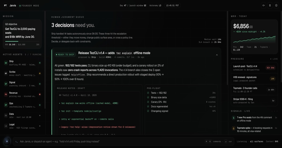
That is why the Founder OS prototype felt stronger than the earlier concept work. The center of the interface was not "analytics." It was a judgment queue. The right rail was not decorative KPI noise. It was live pressure. The whole screen answered a harder product question:
What should the human do next, and why does it matter right now?
That is a much better fit for ShipWithTez than "AI can design landing pages."
How It Showed Up In Practice
The winning prototype had:
- a left rail for today, cadence, and active work
- a center rail with one expanded cost proposal and clear approve, revise, reject actions
- a right rail that translated business stakes into pressure instead of vanity metrics
That is the first Claude Design screen I made that felt like it belonged in a real operating workflow.
The details that helped most were surprisingly tactical:
- asking for
Founder OS.html - using versioned rewrites instead of endless in-place edits
- restarting fresh when a run got flaky
- keeping the screen singular instead of trying to design the whole product
The related build write-up is here: Jarvis Founder Mode
The Key Lesson
Claude Design is downstream of product judgment.
If the prompt is generic, the result will be generic. If the workflow is fuzzy, the screen will be fuzzy. If the design system is weak, the output will drift.
But if you bring a real workflow wedge and a real decision surface, Claude Design becomes much more than a pretty mockup tool. It becomes a fast way to pressure-test how a piece of software should feel before you commit code to it.
That is the part that feels new.
What To Watch Next
- A ShipWithTez-native design system. The current success used the broader Pranoy Tez system. The next jump is grounding Claude Design directly in SWT.
- Code handoff. The more interesting proof is not the screen alone. It is the path from this screen into Claude Code or a local build.
- Short Jarvis-style walkthroughs. The next fun artifact here is a tight video cut showing the decision surface in motion instead of only posting static screenshots.
The real unlock is not that Claude can make nice-looking screens. It is that good product framing now travels much further, much faster, than it used to.
Want to see more projects like this? Browse all builds for interactive tools, dashboards, and case studies with source and build times. Or learn more about ShipWithTez.